|
|
Post by brigante133 on Sept 21, 2006 21:28:23 GMT -5
|
|
|
|
Post by Admin on Sept 22, 2006 6:37:20 GMT -5
Man, these are all terrific! Roy's is just extremely clever, Tupper's is executed crisp and cleanly, while both Leadslinger's and Aircarlos are farly bursting off the page. And Ramon--- an indelible image; probably your best ink and color yet! I honestly can't make up my mind...!  |
|
|
|
Post by Brandon on Sept 22, 2006 8:18:26 GMT -5
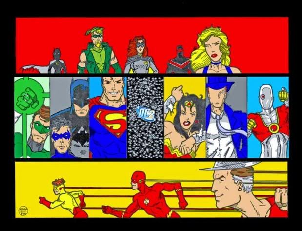
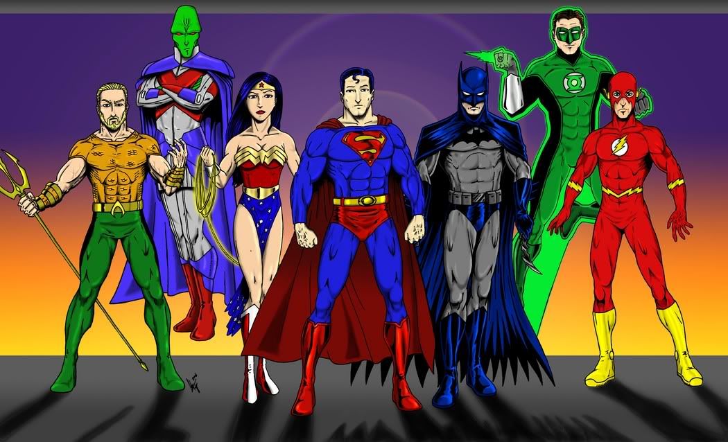
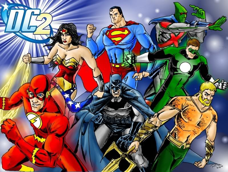
Great pics all around! Awesome work by everyone and David is right in saying that it is a difficult choice. But, I'll make quick critiques and see which one I think is the most bannerworthy.  Leadslinger Leadslinger- Very cool presentation and great character depictions! The color is a little faded but that's nothing that Photoshop would have trouble fixing in a jiffy. The DC2 logo is a little on the small side. Again, this is put together great and I love the Flash panel at the bottom. We have all the main players in the DC2, oh wait, except Aquaman. *whistles* That's a big minus, sir. GoldK- Very smart pic here and I think the effect you've done is brilliant. Really, really cool idea. The DC2 logo is plainly and proudly depicted. We have all the big DC2 characters also but sadly Aquaman has been placed in the back. Plus there is a matter of the flow of the pic going against the eye's natural movement with the character's going from right to left instead of the more common left to right. Again, lots of good stuff going on here and this is a definate contender. Tupper- Really sharp pic here with strong colors and character placement. Aquaman is right up front and standing on equal ground with the other heroes which is acceptable. But, the image is lacking the DC2 logo entirely. We have Barry wearing Wally's belt. And the entire pic is on the longish side, and would squash the other info at the top of the pages if not significantly reduced. Again, amazing pic but there are some problems. Aicarlos- Really nicely done pic. It has a nice kinetic energy to it and moves in an untraditional direction with the focus on Superman and the other main players spreading out around him. The coloring is sparse giving it an airy and majestic feel. A very well crafted piece of art. The bottom of Batman's cape really shows a change in inking style though and is a little distracting. There are also a few noticable absences, the DC2 logo is nowhere to be seen and more importantly, no Aquaman. I mean, we have Martian Manhunter here, but no props for the KING of the entire ocean? Has all my work for the past year been in vain?! *ahem* Excuse me. Where was I? Oh yeah, no Aquaman, no vote. And lastly, Ramon- The artwork and coloring is well executed and again, I like the flow of the characters radiating out from the center. All of the Big Seven are present and accounted for. There are a few rough spots like Superman's profile and some detail work like the highlights on Wonder Woman's metal costume details. Each character exudes a personality in their presentation even if Batman looks like he's about to pass a small car and Aquaman seems to really need to catch up on his sleep. But, Aquaman! He is right up front even if a little behind Barry. The attention to the character in his current look is a strong benefit. Also, we have the DC2 logo not only boldly displayed but it's blazing like a tiny sun. The pic is a bit on the large side though and would consume the top of the page but a resize could work wonders there. Results: Again, an awesome showing by everyone involved and each one is a more than a contender for the DC2 banner. But, when the pros and cons are (jokingly  ) weighed, I'd have to say it comes down to Ramon and his excellent picture displaying Aquaman (and the other heroes). Number Five gets my vote! |
|
|
|
Post by Admin on Sept 22, 2006 9:15:59 GMT -5
This seems like a good place to announce the change in the forthcoming Justice League title:
Premiering Wk 4 of October, the DC2 proudly presents...
Aquaman and the Justice League of Heroes Who Are Friends of Aquaman!
A bit of a mouthful, but we think it's pretty catchy!
;D
|
|
|
|
Post by Brandon on Sept 22, 2006 9:23:00 GMT -5
Finally!!! Now I can stop sending those 20 PMs a day to David requesting the new title. Thank you sir for coming to your senses for considering the title change! |
|
The Anti-Tupper
Staff  Secret Assistant to the Art Director
Because robots have feelings too!
Secret Assistant to the Art Director
Because robots have feelings too!
Posts: 370
|
Post by The Anti-Tupper on Sept 24, 2006 10:33:07 GMT -5
All I have to say is...Aquaman sucks.
Alright, I'm kidding. Actually, not really. He sucks. It was cool that time he fought that monster as a being entirely made of the ocean, but that's not Aquaman.
There's a couple of things I wish to address. Firstly, I didn't think it was our jobs to place the logo in the image. If it was, then I would have done it. I do not dress my work for the site, so it's a bit myopic to use that as a reason not to vote for my image. Secondly, if there's design issues with belts and such, they can be fixed. I happen to be quite good at alterations using Photoshop. The size can be fixed so I fail to see the issue there.
I guess my point is the complaints levied against my image are....well, stupid (no offense). I like Ramon's the best and I voted for it because his is far more dynamic than mine. No problems there. Actually, if that had been your issue, I would have handedly agreed. It was not. Just remember that some of us artists here can alway make changes to images if needed. If you prefered someone else's image to mine, say so. I'm not that sensitive about my work. However, placing knocks against it for formatting purposes? Not cool.
There's my tyrade. Again, Ramon's is freakin' amazing! They all are to be honest. Well done gentleman.
|
|
|
|
Post by Admin on Sept 24, 2006 12:20:20 GMT -5
Adam, Brandon's remarks were strictly tongue-in-cheek, and not to be taken as serious criticism. He was just trying to humorously validate his vote for Ramon's pic. And, perhaps, spread some Aqua-love...!
|
|
|
|
Post by Brandon on Sept 24, 2006 19:05:55 GMT -5
But, when the pros and cons are (jokingly ) weighed... Hence the word "jokingly". This was a light mix of minor composition critiques and what I thought was very obvious, if not dry, humor. Sorry if you've taken offense to this, Adam. I don't believe I've ever deliberately berated anyone's work here and have very clearly said in many, if not all of the other Art Challenges that a work should not be judged on how "finished" it is, but rather the inherent principles and strengths of the piece and the individual voter's opinions. You can go back and verify that if you want. I made it a point to give out as many compliments to each piece as I did mock criticism, and partially did this because this is the first Challenge I haven't participated in since I started them a year ago and felt I could lighten up a bit and have fun. But, now that I know how you really feel about Aquaman, I guess I can go ahead and cross you off my friends list. Tsk tsk, Mr. Tupper and your subaquatic bigotry. |
|
The Anti-Tupper
Staff
Secret Assistant to the Art Director
Because robots have feelings too!
Posts: 370
|
Post by The Anti-Tupper on Sept 24, 2006 21:21:16 GMT -5
You know....I am a moron. Just want to get that out there. I missed completely the joking part....um....yeah....
But that being said....Aquaman still sucks....unless written and/or drawn by Brandon Herren. How's that?
|
|
|
|
Post by Romans Empire on Sept 24, 2006 21:37:43 GMT -5
All of these are really cool but there is a whole lot of 'Big 7' here. I know that was the directive and of course we would want to lead with the big guns on the site. With that said I have to mention how cool Kev's pic is because he managed to be a little more diverse with representation and of course Deadshot is there ;D.
This was a tough choice because of the unique styles and all.
Ultimately I had to go with GoldK's pic because it just looked so damn cool! Or maybe I impress too easy when it comes to this artsie-fartsie stuff but I like what I like!
|
|
|
|
Post by Brandon on Sept 25, 2006 8:07:36 GMT -5
You know....I am a moron. Just want to get that out there. I missed completely the joking part....um....yeah.... But that being said....Aquaman still sucks....unless written and/or drawn by Brandon Herren. How's that? No worries, Adam. I think that DC's handling of Aquaman over the last few years, okay, decade, has been pretty crappy so I can agree with you there. But I think a character that has been successful in a variety of media for around 65 years couldn't really entirely suck. I know a lot of jokes have been made, all spinning out of his depiction on Super Friends 30 years ago, but I'd rather see all the good things that have come from the character. It was my frustration over what DC's done with the character that actually was the catalyst for laying out these ideas for Aquaman over 2 years ago. If you are really interested then I encourage you to read a few of my Aquaman stories and then let me know what you think, whether good or bad. Either way I feel confident that it's a version of the character you probably haven't seen before. |
|
|
|
Post by Brandon on Sept 25, 2006 8:11:33 GMT -5
Wooo! It's starting to look like a tight race!
How long is this poll running, Ramon?
|
|
|
|
Post by brigante133 on Sept 25, 2006 11:24:40 GMT -5
I was thinking all the way up till when the banner will be put up which is next week on monday or tuesday.
|
|
Quester
Staff
Call me 'Q'!
Posts: 681
|
Post by Quester on Sept 25, 2006 11:47:24 GMT -5
I voted Tupper.
|
|
|
|
Post by >>Riz! on Sept 25, 2006 16:09:33 GMT -5
me too.
|
|
|
|
Post by starlord on Sept 25, 2006 22:06:06 GMT -5
I was really torn but I went with Goldk as well. It's really unique looking. Everyone did an awesome job, though. No matter who ends up winning. You should all be extremely proud.
|
|
|
|
Post by chris on Sept 26, 2006 4:15:21 GMT -5
I like all of them , but I voted for Ramon's with Tupper being a very close second. The tie breaker for me was that the more actiony(word or no?) poses I think will draw more people in when they see the site for the first time.
|
|
|
|
Post by artteach on Sept 27, 2006 23:13:14 GMT -5
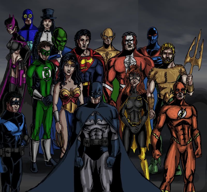 I just did not get her done in time. Maybe she'll be ready for the net banner contest in 07. |
|
|
|
Post by brigante133 on Sept 28, 2006 0:51:00 GMT -5
tsk, this is awesome too! damn, look how much powers inc members he got put in, you'd think people actually read it.  |
|
|
|
Post by Admin on Sept 28, 2006 6:28:52 GMT -5
Nice job, Art!
I see that you have fairly represented a good chunk of the DC2 (both Aquaman and Powers, Inc. are well represented!), but, um *cough* where's the greatest hero of the DC2... Hawkman?
|
|
|
|
Post by starlord on Sept 28, 2006 7:12:31 GMT -5
Yeah, excellent pic there. Well rounded, totally agree with that. However there was no Green Arrow, and really he's much more important then a guy with wings or a guy who breathes under water, isn't he? ;D |
|
|
|
Post by HoM on Sept 28, 2006 8:18:05 GMT -5
Where's The Question? I'll pass. |
|
The Anti-Tupper
Staff
Secret Assistant to the Art Director
Because robots have feelings too!
Posts: 370
|
Post by The Anti-Tupper on Sept 28, 2006 8:26:41 GMT -5
One of these days I'm going to attempt a massive George Perez type image with every DC hero in it, and then and ONLY then will everyone here be happy.
Where's the Question? Where's Aquaman? Where's Hawkman? Where's GA? You guys crack me up. Gold Jerry! GOLD!
|
|
|
|
Post by HoM on Sept 29, 2006 3:28:55 GMT -5
Wheres the ubercool realist renderings of a certain Mr A. Tupper? I'll pass |
|
|
|
Post by Admin on Sept 29, 2006 6:47:56 GMT -5
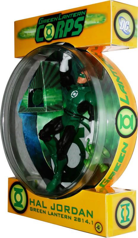
Quick comment: Ramon, isn't there a certain logo missing from Hal's breast...?
|
|
|
|
Post by brigante133 on Sept 29, 2006 12:47:14 GMT -5
not if you look at scott's design for green lantern next year
|
|
|
|
Post by Admin on Sept 29, 2006 12:56:23 GMT -5
Really? Are you sure about that? Just a blank white circle? A GL not wearing a GL insignia seems like a misstep to me....
|
|
|
|
Post by Admin on Sept 29, 2006 12:57:34 GMT -5
Oh, wait, I see it now...
|
|
|
|
Post by HoM on Sept 29, 2006 13:01:46 GMT -5
I think its a clever invention on Scott's part, really nice costume design.
|
|
|
|
Post by Lantern Lad on Sept 29, 2006 16:26:22 GMT -5
Wow... thanks! I was considering putting the symbol in the white circle as well... but that would be a symbol inside a symbol. A bit redundant.
I loved all of the entries, but I fear my vote must go to...
Dramatic Pause
Ramon Villalobos
Homeboy got's the goods in that pic.
My only beef is that Diana looks a bit Butch. Maybe this is the bold new WW era? It's great to see my Hal costume done by someone else... makes me think it just might work!
|
|


 ) weighed, I'd have to say it comes down to Ramon and his excellent picture displaying Aquaman (and the other heroes). Number Five gets my vote!