Dr Dread
Staff  The Odious-1
Posts: 1,547
|
Post by Dr Dread on Jun 22, 2006 12:33:46 GMT -5
|
|
|
|
Post by brigante133 on Jun 22, 2006 17:41:17 GMT -5
i did superman....
's face when superboy prime got done with him.
|
|
The Anti-Tupper
Staff
Secret Assistant to the Art Director
Because robots have feelings too!
Posts: 370
|
Post by The Anti-Tupper on Jun 23, 2006 22:29:17 GMT -5
I have to say that I am not a fan of digital inking. It just doesn't come out as smooth and clean. For me there's little substitute for a good 'ol piece of paper, art stand, mechanical pencil and some pens of varying thickness. I'm not surprised that people don't like inking. It does sometimes feel as though you're retreading your work. Over the years though I've found there's a distinct difference between the two mediums and I actually like inking now. For anything comic related, it's just the right touch. Sometimes I will do a 'realistic' superhero drawing and leave out the pen, but I've certainly embraced it now that I've learned how to color a bit better on the computer.
I was originally with Ramon on using computer paper, and most of my stuff certainly does end up there, but when I'm doing work for this site I use a nice thick 24lb grade paper. It's just a little denser than the usual stuff and I find the work looks just a bit sharper. I also find it easier to erase on it. I always use perforated drawing paper for commissions. It's about the same as matte paper, probably a 90 lb grade, almost coverstock. I like it for the same reasons as the 24lb, AND I think the clients like it better too.....gives that nice aged look, really brings out the pencils when it's just a regular drawing.
I also like Photoshop and I have no opinions on GIMP, since I've never used it. I only wish I knew how to do more in PS.
Character Designs
I really don't have a lot to say about specific designs. More often than not I end up embracing newer designs, as is the case with Batman specifically. Wonder Woman seems to come out different each time I draw her, so I'm trying to stick to a standard for her. One of the girls at the comic store said something that stuck with me. She said that she loved seeing Diana with a little muscle, not too much, but enough to show us that she's fairly buff. I always try and draw her with a bit more muscle, just so you know she can easily kick your ass. It is always a challenge to make her sexy and athletic, and not a ropey weightlifter.
If there's one piece of advice I can give is to study multiple designs for each hero or heroine. If you love Jim Lee's Batman and only look at that, then your drawing will start to look like his. If you study Breyfoygle, Aparo, Adams, Lee, even the old Bob Kane designs, you'll find stuff you like with each one and hopefully come out with something that looks unique to your style. Study your costumes too. Try and be consistant from design to design as it can get annoying to see different pockets and larger symbols all the time. Oh and one more thing; always remember detail. We all know what Batman looks like, but little things like the bat symbol on the bottom of his boots, the length of his ears or how worn the pockets on his bat-belt are really bring out the character. Little things matter, because freaks like me notice that stuff.
Wow, this is long....
|
|
|
|
Post by Brandon on Jun 24, 2006 7:00:43 GMT -5
I love to work in ink and sketch with ink pens about 90% of the time. When I do graphic design I really like to play with the various effects you can get in the simple black and white work. But when it comes to inking a drawing, something I've done in pencil, it's purely frustrating because I can never get it to look as good in ink as it did beforehand. I really admire good inkwork when I see it, I just don't seem to be able to get the results I'd like in more complex images. Maybe I should take the INKING correspondence course from Joe Kubert's School.  |
|
|
|
Post by brigante133 on Jun 24, 2006 7:12:04 GMT -5
I agree with you all the way there tupper. One thing on inking that I think is a problem for people though is that they think it HAS to be as good as pencils if they have good clean pencils and this is definitely not the case. Inking is what gives the drawing a comic book look but also is what gives an artist an easier way to accentuate style. Usually when I ink I do it because honestly what i draw is damn near unreckongizeable in pencils but also because it can be fun if you are doing it the way you like it. Too many people try to make it look like what it should look like and make everything exactly what is penciled, tones and all, but i have been inking drawings since the sixth grade (albeit badly for the better part ) and it can get to be where its just as creative as drawing if you really put an effort into making it look interesting visually. I think Will Eisner put it best when he said inking is the sexiest part of drawing because you dont have to think about making the arm the right size and shape because its already there, you just act on impulse. Also, Don't be afraid of the pen, you can always a. glue paper over it b. use white out or c. just photoshop the bad marks out. So yeah... ink on people. |
|
The Anti-Tupper
Staff
Secret Assistant to the Art Director
Because robots have feelings too!
Posts: 370
|
Post by The Anti-Tupper on Jun 24, 2006 12:16:16 GMT -5
Ink on...
|
|
|
|
Post by brigante133 on Jun 24, 2006 12:31:49 GMT -5
yes yes
|
|
|
|
Post by artteach on Jun 25, 2006 21:34:35 GMT -5
Inking is also when you stop thinking about size and shape and really focus on light, shadow, and textures. I do my work here with a tablet, because this is my chance to practice how to use this thing. If was making $ I would break out the Microns and brushes.
|
|
|
|
Post by thumper727 on Aug 23, 2006 10:59:30 GMT -5
I still cannot figure out how to change my scanned pictures, which are inked by hand into a picture where it is just black and white. You can still see the strokes I used with my marker. Does anyone know what filter to use to get it for the permanent marker I used is one consistent shade of black and the white is white. I could always color over it with black in gimp or photoshop, but that takes forever and does not come out as neat. Does this make sense?
|
|
jrfan133
Staff
Crimefighters never sleep!
Posts: 245
|
Post by jrfan133 on Aug 23, 2006 13:50:41 GMT -5
In Photoshop, just go to Image>Adjust>Curves. This is the box that will pop up: 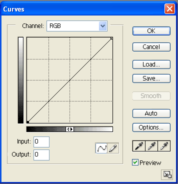 Now see those points at the ends of the line? Drag the left point to the right until the scan is as dark as you want. Depending on the scan, you can also drag the one on the right to the left to lighten it. Like this:  Sometimes the left point controls the lightness and the right point controls the darkness, so keep that in mind. I think it has something to do with the image mode being grayscale as opposed to RGB. Every image is different so you just fool around until it looks how you want it. Hope that answers your question! |
|
|
|
Post by thumper727 on Aug 24, 2006 13:51:56 GMT -5
/\ Thanks jrfan, your advice was perfect as were the diagrams. The same can also be done in Gimp, if you are running that program by going to Layer> Colors> Curves and the same little scale pops up.
|
|
|
|
Post by Brandon on Aug 26, 2006 7:51:32 GMT -5
I can usually adjust the Brightness and Contrast and get scans worked out where I want them. I haven't tried the Curves approach but will have to check it out to see if it is any cleaner than the other.  |
|
|
|
Post by brigante133 on Aug 26, 2006 18:57:59 GMT -5
i am sure they do exactly the same thing but brightness/contrast is simplified and the curves thing can come up with more... "unique inks" usually a combination of both works the best though.
|
|
jrfan133
Staff
Crimefighters never sleep!
Posts: 245
|
Post by jrfan133 on Aug 29, 2006 21:32:34 GMT -5
What do you mean by "unique inks"? I think the difference is Curves/Levels lets you make blacks darker and the whites lighter individually, whereas Brightness/Contrast effects both at the same time. So it gives you more control, but that's just my POV.
|
|
|
|
Post by brigante133 on Aug 29, 2006 22:09:27 GMT -5
i don't mean they are bad, but if you reverse the sides you can do some weird stuff with it you couldn't do in the other way.
|
|
jrfan133
Staff
Crimefighters never sleep!
Posts: 245
|
Post by jrfan133 on Sept 3, 2006 20:40:52 GMT -5
I know you didn't mean anything negative. |
|
Mischief
Staff
I Sit Upon My Throne As The Guardian & The Keeper Of The Lightning.
Posts: 1,517
|
Post by Mischief on Feb 13, 2007 16:40:31 GMT -5
In regards to Superman, I never tried to draw him until Jim Lee's run on Superman. I was intimidated by the Superman 'S' on his chest. I learned to draw hair from studying various comic artists and from various how to draw books. Most recently I picked up Wizard's How To Draw series. It teaches all the different aspect of drawing comics. Perceptive, inking, storytelling and more.
When it comes to inking I've used Microns for the past several years, since I was in high school. I've used quells too, but I'm lazy to clean them. I've been looking to attempt my hand at brush inking.
I'm using Photoshop 5.0, I bought it off EBay for $45, to color my work. I've used color pencils and in the process of getting some more Prismacolor markers. (I saw Olivier Copiel use them at last year's New York Comic Con) Those are some expensive markers too.
And this has been Mischief's two cent.
No refunds
Mischief
|
|