|
|
Post by chris on Jun 4, 2006 18:41:34 GMT -5
I thought it would be a good idea to share tips here. For example I seem to have trouble drawing Superman's face without him looking like hes twelve. Does any one have some advice on drawing Supes' face and hair? I hate drawing hair and it never looks right.
|
|
Dr Dread
Staff  The Odious-1
Posts: 1,547
|
Post by Dr Dread on Jun 6, 2006 21:15:23 GMT -5
Yeah, hair is kind of tricky. Generally when I draw hair, I stay away from over detailing each hair strand. Instead I focus on highlighting the flow of hair; how it's combed; if it's straight or curly. For example: 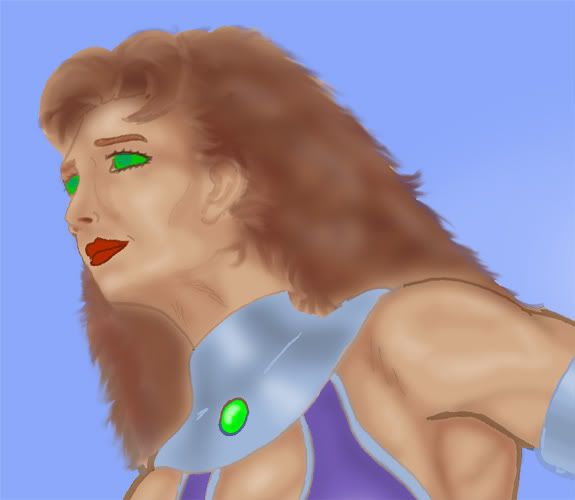 This is a detail of the Starfire picture I did for DC2 Illustarted #1. I attempted to create highlights that show a wavey texture to Starfire's hair. This certainly isn't what real hair looks like, but it does give the impression of hair by texture and flow. In my opinion anyway. |
|
Dr Dread
Staff
The Odious-1
Posts: 1,547
|
Post by Dr Dread on Jun 6, 2006 21:27:25 GMT -5
Does any one have some advice on drawing Supes' face and hair? Sorry, my initial post didn't really cover Superman.  Okay, Superman... right... Superman's face is usually portrayed as rather shiselled, although many modern artists have portrayed him with a lantern jaw. The tip is to accentuate his jaw line (and cleft chin), cheeck bones and brow. The hair is rather simple, since it's usually seen as black (or very dark). Even just the outline of the hair usually works. My point is, often you can do a lot more by detailing less. You just need to pratice what parts to focus on. Hope that helps.  |
|
|
|
Post by brigante133 on Jun 7, 2006 2:25:47 GMT -5
i will post my notes on superman if youd like.
|
|
|
|
Post by HoM on Jun 7, 2006 3:40:29 GMT -5
I would like!
|
|
|
|
Post by artteach on Jun 7, 2006 8:18:11 GMT -5
 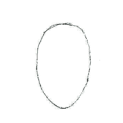 One of my summer projects is working on an art website for my class. These a roughs for some onlne drawing lessons I will be putting up. Now the rules are simplified for students between 5 and 9 years old but most hold true for all faces. Start with a nice oval shape.(for Superman more of a squared off shape) Lightly draw line splitting the oval in half. Draw the lines as lightly as possible. The face follows the rule of halves. The eyes will be on the halfway line down the face and halfway from the center line. Mark your eyes with two light dots. The nose will be halfway down from the eyes. Make a small mark for the tip of the nose. The mouth is halfway from the nose to the chin. Mark your basic mouth shape lightly. The dots for the eyes and the tip of the nose should form a triangle with equal sides. Eyes are usually shaped like footballs. Proper eye size will allow 5 eyes to fit across the face. Draw a circle for the colored part of the eye (the iris) and a smaller circle within for the dark part (the pupil). Eyebrows arch over the eyes. The nose is three curved lines. Then draw a line from side of the nose to the eyebrow. Just put the line from the tip of the nose to the eyebrow on one side. Hair begins halfway from the eyes to the top of the head. Don't start your head at the tip top of the head. Have the lines follow the directions and flow of the hair. Remember most people have hair on the sides of their head as well as the top. |
|
|
|
Post by chris on Jun 7, 2006 15:34:35 GMT -5
Cool so artteach is not just a clever name.  |
|
|
|
Post by artteach on Jun 7, 2006 16:52:11 GMT -5
Nope, it's also a paycheck!
|
|
Dr Dread
Staff
The Odious-1
Posts: 1,547
|
Post by Dr Dread on Jun 7, 2006 17:54:39 GMT -5
Nope, it's also a paycheck! Does that mean that duing the summer you become "boatguy"? |
|
|
|
Post by brigante133 on Jun 7, 2006 18:30:02 GMT -5
hey, hey, hey, LOVEboatguy
|
|
|
|
Post by artteach on Jun 7, 2006 21:19:21 GMT -5
That would be Captain Loveboatguy to you ;D
|
|
|
|
Post by HoM on Jun 8, 2006 2:48:16 GMT -5
Captain LoveBoatGuy?
Does that mean I go from HouseOfMystery to GuyWhoSitsAtTheComputerAndWritesStoriesGuy during the holiday break?
|
|
|
|
Post by chris on Jun 8, 2006 4:34:30 GMT -5
Anyone got some inking advice?
|
|
|
|
Post by HoM on Jun 8, 2006 11:57:50 GMT -5
Don't lie down whilst inking, and start with the big lines first, then do detail last. Don't do both at the same time.
Wait for the ink to dry!
|
|
|
|
Post by artteach on Jun 8, 2006 13:19:16 GMT -5
Ink the outside of characters with a heavier line. If you look at Adam Hughes or whoever inks Greg Land that is what they do.
Close your shapes so the colorist can fill the flats easier.
Have a clean paper to place under your hand/arm so you don't smudge.
Use Archive ink markers, quill pens, and brushes when working.
Brushes for big black areas, leaves, trees, and organic stuff.
Quill Pens for medium sized areas.
0.005 and other very fine pointed archive ink markers for little stuff.
A light table is great for inking. You can make one with a cheap florescent workshop light, a 2X4, and a nice sheet of plastic. Make a box, toss the plastic sheet on top, put the light under and plug in. MY light table is 3' by 4' which gives me room to work.
By a tablet PC and you never need to ink again.
|
|
|
|
Post by Brandon on Jun 8, 2006 17:34:38 GMT -5
Or, you can just do really clean, sharp pencils and adjust the contrast/brightness after you scan it and you don't have to ink at all. ;D
My wacom is really small so it's hard to use for inking/drawing. Plus I can't get the pressure settings right. Plus I just like physically drawing things first. It's my favorite part. Sometimes I ink and sometimes I don't, just depending on the piece. For example, I didn't ink any of the zero issue covers that were used to make the mainpage banner at the top of the page there due to time constraints in the first month (it was a very, very, very busy month) but rather dressed the pencils up after I scanned them. The only place you can really tell is on Aquaman's shirt I think.
I do ink some pics though, like the most recent cover to Aquaman #7. For that I wanted to make sure that I got really defined lines so I inked it. When I ink I mostly use whatever pen I have handy mixed with sharpies for the large areas. The pens I get cheap at a small office supply store downtown, usually .03s and .05s.
|
|
|
|
Post by brigante133 on Jun 8, 2006 19:37:35 GMT -5
my inking is always done by hand since i cant ink with a mouse and dont have clean enough pencils. what i do though is just draw right over the pencils because lightboxes are hard for me to work with. its just uncomfortable and complex. everything i do is done with big chisel tip sharpies since they have more ink and pilot pens that cost like a buck or so at ANY store from savemart to the school store so its not hard to come by, i just try to keep it simple.
|
|
|
|
Post by chris on Jun 18, 2006 15:05:49 GMT -5
|
|
Dr Dread
Staff
The Odious-1
Posts: 1,547
|
Post by Dr Dread on Jun 18, 2006 21:19:44 GMT -5
Yeah I had forgotten I wanted to put a quick inking tip here.
My tip:
Use bond paper. ;D No, seriously. Bond paper is bright and white, but just transluscent enough to see dark lines beneath it. It'll scan better than tracing paper. It's also a good medium for markers, since it resists bleeding. Now, be aware that there are different types of bond paper, and you might have to try a few to find the right one.
|
|
|
|
Post by brigante133 on Jun 19, 2006 1:30:15 GMT -5
what is bond paper?
|
|
|
|
Post by HoM on Jun 19, 2006 2:12:25 GMT -5
BOND, PAPER BOND!
|
|
|
|
Post by brigante133 on Jun 19, 2006 14:16:00 GMT -5
oh everday shoe... "funny" is such a strong word to define what he cracks in every thread
|
|
Dr Dread
Staff
The Odious-1
Posts: 1,547
|
Post by Dr Dread on Jun 19, 2006 16:37:43 GMT -5
When you go to an art store, you'll see all sorts of different paper pads. Sketch paper, marker paper, watercolour paper, canvas paper, bristol paper et al. One such category is bond paper. |
|
|
|
Post by brigante133 on Jun 20, 2006 0:55:01 GMT -5
oh, i just use printer paper unless i see some nice cheap paper at rite aid.
|
|
Dr Dread
Staff
The Odious-1
Posts: 1,547
|
Post by Dr Dread on Jun 21, 2006 20:39:10 GMT -5
Geeze.. I've got 7 different types of paper in my apartment.  |
|
|
|
Post by thumper727 on Jun 22, 2006 0:17:24 GMT -5
My suggestions after reading what you guys have said... SUPERMAN For Superman, i gernerally like keeping him look younger, but obviously 12 is to young, but I would think he ages more slowly than average humans. I also give him thick eyebrows, which draws out the blue in his eyes, which is a big trademark of Superman. For the hair, as long as you put in that little hangy swirl in the part it will look alright. INKING My sketchbook is 80lb paper which I think works the best, because the lighter paper tends to smear more. I use Pigma Micron markers, which i think work the best, especially for very fine details. Here is a link, www.reuels.com/reuels/page128.html you can find them at Micheals and they are about 2 dollars a piece, but they are worth every cent and they last for a while. For bigger areas I use Sharpies, but they tend to bleed on the paper. To me, hand inking always looks better and more professional then when it is done on the computer. COLORING I really like using Photoshop to color, because i think it looks more professional. I am also beginning to like watercolors though. I also use color pencils, but it is important to get a blending colored pencil so your strokes show up less. Also, for those who cant afford Photoshop or cannot find any other means to find it, I suggest using the Gimp. It is a free photoshop-like program that works good for coloring. Photoshop os still better and has much more features, but you cannot beat the price of Gimp. LIGHTBOXES I still need to get around to making my own, but these are a great tool to have. They do cost a lot which is why it is cheaper to make your own. |
|
|
|
Post by artteach on Jun 22, 2006 0:27:59 GMT -5
Ditto for all that thumper said, now pretty soon digital inking may become equal to hand inking, but I don't see many people who are really good at it. I'm working at it, but it is so hard to keep it from looking wiggly.
I like 80# paper for smaller things and stuff I am going to scan. If I am painting or working bigger than 11x17 I like bristol board. If you buy a larger sized board, cut and rule it yourself it is alot cheaper than buying the pre ruled boards.
|
|
|
|
Post by Brandon on Jun 22, 2006 7:16:49 GMT -5
I mostly use sketchbooks. When I do a "deluxe" piece or something I know I want to look nice and have as artwork, I'll use Bristol board which I either purchase in a mid-size pad or in larger ones and cut them down. I switch between inking and not inking before scanning. I'm not the best inker so I'm slowly trying to weed that part of the process out entirely. If I had a larger Wacom (and knew how to use the settings better) I would try my hand at digital inking more. Sometimes I'll lift drawings from my sketchbook and lightbox them onto Bristol to put a piece together. My lightbox being a little plastic Crayola one my wife purchased at a yard sale. Ha. But if I get the batteries on a good connection it's plenty bright to pick up the art, even with the thicker Bristol paper. I would say that just looking at Ramon's work makes a good argument for GIMP. I sometimes forget he's not using Photoshop. I haven't used the program but from having discussions with Ramon it sounds like it's pretty close to PS in functionality. |
|
|
|
Post by thumper727 on Jun 22, 2006 11:41:56 GMT -5
Coloring wise Gimp is very close to Photoshop. Gimp however sucks when you are trying to but words on the picture or going for some of the effects photoshop has.
|
|
|
|
Post by brigante133 on Jun 22, 2006 12:09:59 GMT -5
I think that very much depends on what you are trying to do and how you are doing it.
|
|