|
|
Post by detectivebats on Nov 14, 2005 13:24:41 GMT -5
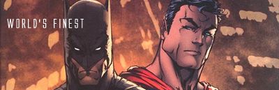
Hey everybody! I'm new here, and I just wanted to share some random art with y'all. I'm currently an animation student but I adore anything comic-related (aspiring comic book artist, perhaps even!) so anyway, here's just some of the stuff I've done. My art site also, if you actually wanted to see more (not just DC things either, though I have to say I love both Batman and Superman insanely and will probably be working on more stuff of them soonly), is www.michellebridges.com .   "Bruce and Clark"  Just a random angsty Bruce |
|
|
|
Post by HoM on Nov 14, 2005 14:15:10 GMT -5
This is quite good. You have your own unique style, and it works! I like it...
|
|
|
|
Post by detectivebats on Nov 14, 2005 14:16:17 GMT -5
Thank you very much!
|
|
Dr Dread
Staff  The Odious-1
Posts: 1,547
|
Post by Dr Dread on Nov 14, 2005 14:18:48 GMT -5
I like them. Especially the Bruce and Clark picture. You put a lot of character in their pose. That gives it more human interest. Good job!
|
|
|
|
Post by starlord on Nov 14, 2005 14:45:54 GMT -5
very good
|
|
|
|
Post by starlord on Nov 14, 2005 14:46:22 GMT -5
I agree with the doc. They are all really good, and that Clark/Bruce pic definatley has it's own character!
|
|
Dr Dread
Staff
The Odious-1
Posts: 1,547
|
Post by Dr Dread on Nov 14, 2005 15:29:30 GMT -5
I hope you don't mind a bit of constructive criticism. I like the angst filled Bruce. It's well positioned and well drawn. The thing you might want to play with are different thickness of ink lines. I'd like to see at least three different thicknesses in that picture. Differences in thickness of inklines can really help with motion, texture and perspective. Right now, Bruce looks kind of flat with the background. It may seem like a small nitpick, but you'd be surprised how great an effect it can have on the overall picture. Here's an example of a pro's ink on his own pecils: jbgallery.ourbunch.net/dp04pencils/images/dp04.00.jpgCheck the difference is the thickness of his inklines, especially between the main charcacters. |
|
|
|
Post by Admin on Nov 14, 2005 15:58:57 GMT -5
I think Doc has a good point, but speaking for myself, I actually like the pic titled "angsty Bruce" best of all! Reminds of a Victorianesque P. Craig Russell pic--- I would love to see it colored!
Welcome aboard, Detectivebats!
|
|
|
|
Post by Brandon on Nov 14, 2005 16:36:01 GMT -5
Yep, welcome aboard, Detectivebats! Great pics, thanks for sharing your work. Nice to see a different approach as you seem to blend manga influences seemlessly into your work without it being too overt. I also like the coloring on your Superman quite a bit. Great stuff, can't wait to see more!!
|
|
|
|
Post by brigante133 on Nov 14, 2005 18:34:25 GMT -5
hello, (michelle is it) good work on those. like everyone i like that batman and superman a lot. the poses work. one question though, what is with the cravats? can't wait to see if batman ever gets a costume in your work ;D
|
|
|
|
Post by detectivebats on Nov 18, 2005 11:20:17 GMT -5
Thanks everybody for the kind words, I really appreciate it! And yes, I will draw a costumed Batman. Eventually. ^__^
drdread: Thanks for the tip! I don't mind constructive criticism at all, it helps me certainly and I do want to learn! I appreciate it. ^__^
|
|